Real-world data
in context
Step-by-step written instructions
Short videos
Lots of Sample Projects
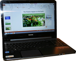
Microsoft PowerPoint: “Clues to the Truth”
Your data is supposed to tell a story, but rows of numbers can be difficult to read. The numbers, precents and formulas just get lost, and your message isn’t heard.
Consider presenting your data graphically. People can look at a pie chart and see that one slice of “pie” is bigger than the rest. We can use Excel, as part of Microsoft PowerPoint, to create charts.
Mastering Microsoft Office is a pathway to a better job.
Our courses cover BEGINNING and INTERMEDIATE and EXPERT concepts from the PowerPoint 2019 MO 300 as well as the PowerPoint 2016 MOS certification exams.
Lesson Demo: Counting Chickens

Lesson: Charts and Chart Tools
- Insert and modify Charts in PowerPoint.
- Use the Chart Elements to format the Chart Title, Axis Title and Data Table.
- Format the Axes and the Gridlines.
- Use the Chart Tools to change the Chart Type, edit the Chart data, and apply Chart Styles.
- Use the Format Ribbon to Resize a Chart and edit the Position on the slide